Brand assets
The Burl & Bowl identity
Everything needed to represent Burl & Bowl consistently — on the site, at fair booths, on care cards, tags, and social. When in doubt: warm, quiet, wood-first.
Logo
Primary wordmarkTransparent PNG. The bowl replaces the second O — never rebuild it in type.Download logo.png
On dark
The warm brown mark holds up on Walnut. Avoid busy photo backgrounds without a veil.
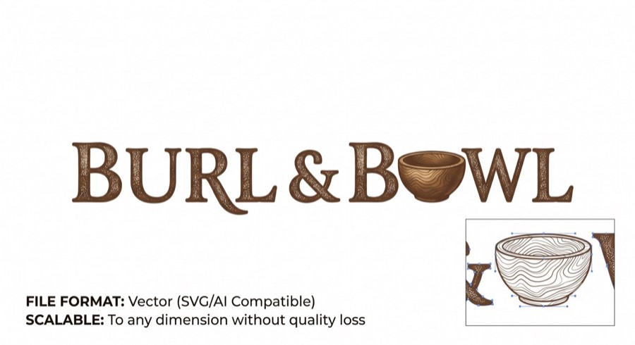
Bowl mark
The standalone bowl works as an avatar, stamp, or brand on the underside of each piece.
Rules: keep clear space around the mark equal to the bowl's height · don't stretch, recolor, or add effects · minimum height 24px on screen · on photos, place over the dark gradient veil (see homepage hero).
Color
Walnut#2A1F16 · ink, dark grounds
Heartwood#6B4530 · primary, buttons
Brass#B98A3E · highlights, eyebrows
Patina#47685A · links, badges
Curl#F4EFE6 · page background
Paper#FFFDF8 · cards, surfaces
Ratio guide: mostly Curl and Paper, Walnut for text, Heartwood for one primary action per view, Brass and Patina as seasoning — never as large fills together.
Typography
Fraunces — display & headlines
Weights 500–650. Used for headlines, prices, and anywhere the brand speaks loudest. Fallback: Georgia, serif.
Instrument Sans — body & interface
Weights 400–600. All body copy, navigation, forms, captions. Fallback: system-ui, sans-serif.
Eyebrow labels — brass, tracked wide
12px, 600 weight, .22em letter-spacing, uppercase. One per section.
Voice
Warm, not preciousPlain words about real wood. "Hand wash, never the dishwasher" — not "artisanal care rituals."
The wood leadsCredit the tree. Describe figure, grain, and origin before technique.
One of oneEvery piece is numbered and has a record. Say so — provenance is the brand.

